Why Create a Wash Effect on a Feature Wall?

Time:2026-09-10 Author:Isabella
0%

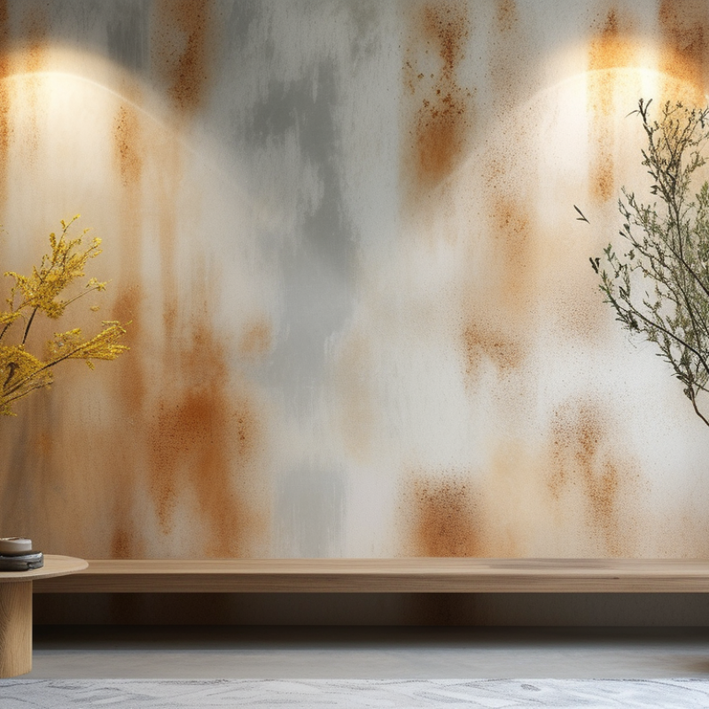
A feature wall can change a room without demanding a complete renovation. A soft wash effect adds movement, depth, and visible handwork to an otherwise flat surface. It can resemble diluted limewash, weathered plaster, or sunlight fading across an old Mediterranean wall. The result feels warmer than a single colour, yet calmer than a heavily patterned mural.

This growing interest reflects a wider renovation culture. The 2024 Houzz & Home Study reported that U.S. homeowners continued investing in home improvements, with median renovation spending reaching $24,000 in 2023. That figure makes selective upgrades increasingly practical. One carefully treated wall can create a strong visual feature without repainting an entire room. The U.S. Environmental Protection Agency also notes that indoor pollutant levels can be two to five times higher than outdoor levels. Therefore, low-VOC paints and good ventilation should influence material choices, not merely appearance.

This guide explains How to create a "wash" effect on a feature wall using controlled dilution, layered colour, and a textured brush or cloth. Expect variation. Perfect symmetry is not the goal. Small overlaps, softened edges, and slightly darker corners often create the most convincing finish. Still, randomness needs direction. Poorly prepared plaster, excessive water, or rushed drying can produce stains instead of character. I have found that testing the mixture on cardboard first prevents expensive surprises. The wall should feel naturally aged, not accidentally unfinished. Colour selection, surface preparation, and patience remain more important than expensive tools. Perhaps the technique is less effortless than it appears. That is worth remembering.
Why Create a Wash Effect on a Feature Wall?

Define Wall Washing and Its Role in Feature-Wall Design

Wall washing is a lighting technique that spreads a broad, even beam across a wall. The fixture usually sits away from the surface, reducing harsh shadows and bright hotspots. This differs from wall grazing, which places light close to the wall and strongly reveals texture.

In feature-wall design, wall washing makes the surface feel wider and more intentional. It can highlight painted panels, stone, timber, or a carefully arranged art display. A soft beam from the ceiling may create a calm vertical glow, while concealed lighting can produce a cleaner architectural effect. Light colour also matters. Warm white can make timber feel richer, but it may change the appearance of pale paint.

I have found that spacing is often underestimated. Two fixtures placed too far apart may leave dark gaps between pools of light. Fixtures placed too close can create distracting glare. A matte wall usually distributes light more gently than a glossy finish. Before final installation, test the lighting at night and view it from normal seating height. I once judged a wall from directly below and missed a visible hotspot near eye level. That mistake was useful. Feature-wall lighting should support the room, not compete with it.

Use 2700–3000 K Light and CRI 90+ to Reveal Surface Color

A feature wall can look rich in daylight, then appear flat after sunset. The difference often comes from light quality, not paint. For accurate surface color, choose 2700–3000 K light. This warm range reveals reds, browns, and muted neutrals without making the wall feel icy. A color rendering index of 90 or higher matters too. It helps show subtle undertones that lower-quality light can hide. Small shifts still happen.

In residential projects, I test the actual finish under the proposed fixture before approving the layout. A painted sample goes beside trim, flooring, and furniture. Then I check it at morning, dusk, and late evening. A 3000 K source may clarify gray-green paint, while 2700 K can soften terracotta or walnut tones. The result depends on beam angle, wall distance, and dimming level. Too much brightness can erase texture through glare.

CRI CRI is useful, but it is not the whole answer. The wall’s sheen, surrounding colors, and camera exposure can change what people perceive. I once trusted a digital rendering and selected a light that looked warmer than expected in the room. That assumption was wrong. A physical evening test would have caught it. Use a dimmable fixture, aim light evenly, and leave space between the beam and artwork. If the finish is textured, inspect it from sitting and standing height. Those small checks make color decisions more dependable, though never perfectly predictable.

Apply the 1:3 Setback-to-Wall-Height Rule for Even Illumination

Why Create a Wash Effect on a Feature Wall?

A wash effect can turn a plain feature wall into a calm architectural surface. Light spreads across the finish, revealing texture without creating harsh bright spots. In my experience, the setback matters more than fixture brightness. A light placed too close often produces scalloped patches and dark upper corners. The wall may look dramatic, but not evenly illuminated.

Use the 1:3 setback-to-wall-height rule as a practical starting point. Measure the wall height, then position the light approximately one-third of that distance away from the wall. For a 3-metre wall, begin around 1 metre out. Aim the beam toward the wall, not directly into the room. Check the result at night, because daylight can hide uneven transitions. Surface colour, texture, ceiling height, and beam angle will still change the outcome.

Tips: Mark the proposed setback with tape before installation. Test one section first. Move the light slightly if the top edge looks too bright. Matte finishes usually create a softer wash, while rough surfaces exaggerate shadows. Do not treat the 1:3 rule as an absolute formula. I have found that small adjustments can improve the result, especially on irregular stone or heavily textured plaster. Photographs can help, but viewing the wall from normal standing positions is more reliable. Expect some trial and error.

Why Create a Wash Effect on a Feature Wall? - Apply the 1:3 Setback-to-Wall-Height Rule for Even Illumination
Wall Height Recommended Fixture Setback Setback-to-Wall-Height Ratio Wall Width Suggested Beam Angle Typical Fixture Spacing Target Average Illuminance Expected Illumination Result
2.4 m 0.8 m 1:3 4.8 m 24°–36° 0.9–1.2 m 150–250 lux Balanced vertical wash with reduced hot spots
2.7 m 0.9 m 1:3 5.4 m 24°–36° 1.0–1.3 m 150–250 lux Even coverage across standard interior feature walls
3.0 m 1.0 m 1:3 6.0 m 30°–40° 1.1–1.5 m 200–300 lux Good balance between wall brightness and ceiling spill
3.6 m 1.2 m 1:3 7.2 m 30°–40° 1.3–1.7 m 200–300 lux More uniform illumination on taller architectural surfaces
4.2 m 1.4 m 1:3 8.4 m 36°–50° 1.5–1.9 m 250–400 lux Soft vertical emphasis with improved brightness distribution
4.8 m 1.6 m 1:3 9.6 m 36°–50° 1.7–2.2 m 250–400 lux Consistent wall grazing for large public or commercial interiors
6.0 m 2.0 m 1:3 12.0 m 40°–60° 2.0–2.6 m 300–500 lux Wide, controlled wash suitable for high feature walls
Planning reference: The 1:3 rule means the fixture setback is approximately one-third of the wall height. Final spacing, beam angle, output, surface reflectance, and mounting position should be verified through a lighting calculation or on-site mock-up.

Target 100–300 Lux to Emphasize Texture Without Excessive Glare

Why Create a Wash Effect on a Feature Wall?

A wash effect gives a textured wall a controlled visual presence. The practical target is 100–300 lux, measured vertically across the wall surface. This range can reveal stone, timber grain, plaster, or ribbed panels without making the surface appear harsh. It is an accent-lighting target, not a task-lighting requirement. The 2021 edition of EN 12464-1 commonly specifies around 300–500 lux for many indoor work areas, so a feature wall usually needs less light.

Use a calibrated lux meter at several points, including the upper and lower wall zones. Do not measure only beneath the luminaire. A 100 lux reading may look rich on dark stone but weak on pale plaster. Surface reflectance changes everything. The Illuminating Engineering Society’s Lighting Handbook also stresses that brightness distribution and glare control influence visual comfort, not illuminance alone. Keep the beam aimed across the texture, while avoiding direct views of the light source. Short spacing can create bright scallops.

In practice, dimming matters. Start near 100 lux, then increase gradually toward 200 or 300 lux. Watch the wall from the main viewing position. If the texture disappears, the beam may be too wide. If the wall feels aggressive, the angle or contrast may be wrong. CIE 117:1995 identifies glare as a measurable design concern, but measurement cannot replace observation. I sometimes overestimate brightness on site. The wall looks better after reducing it. That is worth questioning.

Why Create a Wash Effect on a Feature Wall?

A controlled wall-wash illuminance of 100–300 lux can reveal surface texture, depth, and material variation while helping limit excessive glare.

The example readings represent practical design targets for different wall finishes. Deeper or more irregular textures generally require higher illuminance, while glossy surfaces should be kept toward the lower end of the range to reduce reflected glare.

Choose LEDs Delivering 80+ lm/W to Improve Energy Efficiency

Why Create a Wash Effect on a Feature Wall?

A feature wall can change the mood of a room without adding more furniture. A gentle wash reveals stone texture, wood grain, paint depth, and artwork details. The result feels intentional rather than flat. However, attractive lighting should not create unnecessary energy demand. Choose LEDs delivering 80+ lm/W to improve energy efficiency while maintaining useful brightness. This specification shows how effectively a fixture converts electricity into visible light. In practice, wall color and surface texture also affect the final effect.

Tips: Compare tested lumen output, wattage, beam angle, and color temperature before installation. Measure the wall width and mounting distance carefully. A narrow beam may create harsh stripes. A wider beam usually produces smoother coverage. Ask for photometric data when available. It supports a more reliable lighting decision.

High-efficiency LEDs can reduce operating costs, especially when a feature wall remains illuminated for many hours. Dimming controls can lower output during quiet periods and preserve visual comfort. Warm white light often suits hospitality, living, and gallery settings, but the best choice depends on the materials. A practical mistake is treating 80+ lm/W as the only buying criterion. Poor glare control can ruin an otherwise efficient design. I would review the surface after dark, because daytime impressions can be misleading. The wall may need fewer fixtures than expected—or better spacing.

FAQS

: What light color temperature helps reveal wall colors accurately?

: Choose 2700–3000 K light for a warm, natural appearance. It reveals reds, browns, and muted neutral tones. The result may still change slightly.

Why does CRI matter for a feature wall?

A CRI of 90 or higher reveals subtle undertones more clearly. Lower-quality light can hide green, gray, or brown influences. CRI is not everything.

Should I test the actual wall finish before installation?

Yes. Place a painted sample beside trim, flooring, and furniture. Check it in the morning, at dusk, and late evening. Digital images can mislead.

How can 2700 K and 3000 K light change color perception?

Around 3000 K may clarify gray-green paint. Around 2700 K can soften terracotta or walnut tones. The room decides too.

What is the 1:3 setback-to-wall-height rule?

Position the light about one-third of the wall height from the wall. For a 3-metre wall, begin approximately 1 metre away. Treat this as a starting point.

Why can a light placed too close look uneven?

It may create scalloped patches, harsh bright spots, and dark upper corners. The wall can look dramatic but poorly balanced. Brightness cannot fix bad placement.

How can I test a wall-washing layout?

Mark the proposed setback with tape before installation. Test one wall section at night. View it from sitting and standing positions. Normal viewing matters more than photographs.

Does wall texture affect the final lighting result?

Yes. Rough plaster or irregular stone can exaggerate shadows. Matte finishes usually create a softer wash. Texture remains unpredictable.

What other factors change how a wall appears?

Beam angle, wall distance, dimming level, sheen, and surrounding colors all matter. Camera exposure can also distort the perceived finish. I once trusted a digital rendering. That assumption was wrong.

Conclusion

A wash effect transforms a feature wall into a balanced visual focal point by spreading light smoothly across its surface rather than creating narrow, harsh beams. How to create a "wash" effect on a feature wall begins with selecting warm white light between 2700 and 3000 K, which helps reveal natural surface colors, and a CRI of 90 or higher for accurate rendering. Positioning is equally important: using a setback roughly one-third of the wall’s height, following the 1:3 setback-to-wall-height rule, can produce more even illumination from top to bottom.

For effective emphasis, aim for approximately 100–300 lux. This range can highlight texture, relief, and material details without causing excessive glare or visual discomfort. Energy performance also matters, so choose LED sources that deliver at least 80 lumens per watt. With the right color quality, spacing, brightness, and efficiency, wall washing can add depth and atmosphere while keeping the feature wall clear, refined, and visually comfortable.

Isabella

Isabella

Isabella is a dedicated marketing professional with a sharp focus on driving brand growth and engagement through strategic content creation. With an extensive background in digital marketing, she combines her passion for storytelling with her keen understanding of industry trends to deliver......