Lighting can make a product look premium, ordinary, or completely misleading. A slight angle change may reveal texture, soften reflections, or create a distracting shadow. This guide explores the top 10 best lighting angles for product photography, using practical studio methods and visual examples.
What is the best lighting angle for product photography? There is no universal answer. The ideal position depends on the product’s shape, surface, color, and intended mood. A 45-degree key light often gives balanced form, while side lighting emphasizes texture and rim lighting separates dark products from dark backgrounds. Flat front lighting can appear clean, but it may remove useful depth. Small adjustments matter.
During real shoots, photographers often move the light only a few centimeters. That change can alter a glass highlight or turn a soft shadow into a harsh line. Diffusers, reflectors, flags, and white cards provide better control than brightness alone. Start with one light. Observe the shadow edge. Then adjust the height, distance, and angle separately.
Some recommendations may not work perfectly for every setup. A glossy bottle can reject a carefully placed light, while a white package may lose its edges. That is where testing becomes essential. Review the image at full size, not only on the camera screen. Reliable product photography combines technical knowledge, repeated practice, color accuracy, and honest evaluation. The following angles offer a practical foundation, but your product should make the final decision.
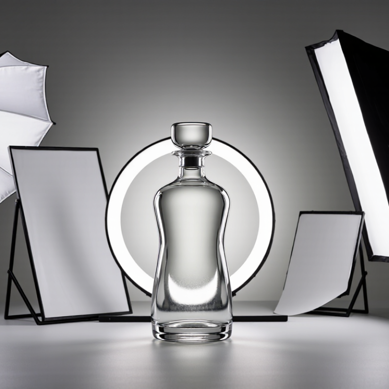
When accurate product color matters, I begin with a 0° front light. The source sits close to the camera axis and faces the product directly. This angle reduces side shadows and keeps labels, coatings, and surface colors visually consistent. I use a light rated at CRI 90 or higher, preferably CRI 95 for demanding color work. The color temperature stays between 5000 and 5500 K.
Keep the setup simple. I place the product on a neutral gray surface and set a custom white balance with a calibrated gray card. At 0°, reflective packaging may show a bright hotspot near the lens. A large diffuser can soften it without changing the product’s apparent hue. The light should be evenly spread across the front panel. Check the corners carefully.
At 15°, I move the light slightly above or off the front axis. This small shift adds gentle form while preserving most color accuracy. It can reveal embossed text, shallow curves, and fabric texture better than flat 0° lighting. I watch for a darker edge on the opposite side. It is easy to overlook.
My practical mistake was trusting the camera preview too quickly. The screen looked neutral, but the exported image carried a mild green cast. Now I inspect a color reference beside the product and review the histogram. Even with excellent CRI, mixed room light can reduce reliability. Turn it off when possible. Photograph a test frame before the full series.
A 30° or 45° three-quarter light gives product photography controlled dimension. Place the key light slightly above the product and move it sideways from the camera axis. At 30°, surfaces look cleaner and more commercial. At 45°, edges reveal stronger shape, texture, and depth. I usually begin with a large diffuser, then adjust its height until the shadow falls behind the product.
A 2:1 fill ratio keeps the shadow side visible without flattening the form. It means the key side receives twice the light of the fill side, creating a one-stop difference. Use a white reflector or low-powered fill source near the camera. A handheld light meter helps, but reflective packaging can mislead the reading. Check the histogram and inspect the darkest edge at 100% magnification.
Baymard Institute’s large-scale product-page research repeatedly identifies image inspection as a major usability concern across hundreds of ecommerce sites. Clear shape and texture support that expectation. ISO 3664 viewing standards also reinforce controlled illumination and consistent color evaluation. Still, a perfect ratio is not universal. Glossy metal may need a weaker fill, while dark fabric can tolerate more lift. I often over-light the first test. That mistake reveals lost texture quickly. Rotate the product a few degrees before changing the entire setup.
Top 10 Best Lighting Angles for Product Photography?
A 60° side light is a reliable starting point for revealing texture. It skims across leather grain, brushed metal, and raised packaging details. At 90°, the light strikes from the side and produces stronger edge separation. Shadows become deeper, but surface defects also become harder to hide. I often begin with 60°, then rotate toward 90° while watching the highlight move across the product.
The relationship follows E ∝ 1/d². If the lamp moves twice as far away, illuminance falls to roughly one quarter. This comes from the inverse-square principle described in the Commission Internationale de l’Éclairage’s photometry guidance. The CIE also identifies 683 lm/W as the maximum photopic luminous efficacy at 555 nm, which supports accurate exposure calculations, but it does not replace visual judgment. Measure at the product surface.
Small changes matter. A five-centimeter shift can soften a sharp highlight. A black card on the opposite side can deepen texture without increasing contrast everywhere. The U.S. Department of Energy’s 2023 solid-state lighting reports emphasize measurement consistency and optical control in lighting evaluation. That lesson applies in the studio.
I still misjudge it sometimes.
Glossy objects may need a larger source, even at 90°. Matte objects can look flat at 60° if the background absorbs too much light. Check the histogram, surface detail, and reflected environment before changing exposure. Perfect angles are rarely perfect.
60° and 90° Side Light: Reveal Texture Under E ∝ 1/d²
How to read the chart: The values are normalized geometric components for a flat surface, with the lighting angle measured from the surface normal. Normal illumination follows cos(θ), while the tangential component that creates grazing highlights and texture definition follows sin(θ).
At 60°, the surface receives 0.50 normal illumination and 0.87 tangential illumination. At 90°, direct normal illumination approaches zero while the tangential component reaches 1.00, producing strong edge highlights and visible surface relief when the light is positioned carefully.
Distance also matters: under the inverse-square relationship E ∝ 1/d², moving a light from 1 m to 2 m reduces ideal illuminance to 25% of its original level, before accounting for beam spread, modifiers, and surface reflectance.
A 120° or 135° back light can separate a product from a dark background without creating an obvious halo. Place the light behind the subject, slightly toward one side. Aim it across the edge, not directly into the lens. Start one stop brighter than the key light. For glossy products, two stops may add useful rim definition. More than that often looks artificial.
Use an incident light meter at the product’s brightest edge. Record the key exposure, then adjust the back light to a 1–2 stop offset. A one-stop increase doubles illuminance, while two stops produce four times the light. This relationship follows standard photographic exposure practice. The CIE 015:2018 photometry report also reinforces the need for measured, repeatable lighting rather than visual guesses.
Keep color controlled. ISO 3664:2009 identifies D50 conditions as a reference for critical image evaluation, with a 5000 K viewing environment. Match your working lights closely when color accuracy matters. I usually check a gray card before shooting. Sometimes the rim becomes too clean. That is a warning. Lower the light, soften its modifier, or move it closer to the 120° position. Dark glass and chrome may still need a white card opposite the back light. The setup is not perfect. Reflection control often matters more than power.
| Rank | Light Angle | Primary Lighting Position | Recommended Power Relationship | Separation and Edge Definition | Typical Shadow Result | Best Product Applications | Practical Setup Notes |
|---|---|---|---|---|---|---|---|
| 1 | 45° | Light placed 45° to the camera axis and slightly above the product. | Key light at the reference exposure; fill light typically 1–2 stops lower. | Creates balanced form, visible texture, and moderate side separation. | Natural-looking side shadow with clear dimensional modeling. | Packaging, small electronics, ceramics, tools, and general catalog products. | Use a large diffused source for soft transitions and rotate the product to control highlight placement. |
| 2 | 60° | Light positioned 60° from the camera, elevated above the product. | Key light is the reference; fill is commonly 1–2 stops lower. | Improves contour visibility while preserving front-facing product detail. | Longer lateral shadow with stronger surface definition. | Bottles, footwear, textured goods, and products with dimensional surfaces. | Flag the source if the near side becomes too bright or reflective. |
| 3 | 90° | Light placed directly to one side of the camera-to-product axis. | Key exposure is the reference; use fill 2 stops lower for stronger contrast. | Strongly separates front and side planes and reveals product geometry. | Defined side shadow; contrast increases noticeably on glossy surfaces. | Furniture details, mechanical objects, textured materials, and sculptural products. | Use diffusion or a scrim to prevent harsh specular reflections and clipped highlights. |
| 4 | 120° | Back-side light positioned 120° around the product relative to the camera. | Back light set 1 stop brighter than the key; reduce to equal power for reflective products. | Produces a visible rim along one edge and separates the product from a darker background. | Front remains controlled while the rear edge gains a clean highlight. | Dark packaging, bottles, glass, metal objects, and products photographed on dark sets. | Keep the source just outside the camera frame and use a flag to prevent lens flare. |
| 5 | 135° | Back-side light placed 135° from the camera, aimed toward the rear edge. | Back light typically 1–2 stops brighter than the key for a pronounced rim. | Creates strong edge separation while retaining readable front-side detail. | Rear highlight wraps around the contour; front shadow stays comparatively soft. | Transparent packaging, dark products, cosmetics, footwear, and polished objects. | Start at a 1-stop offset and increase only when the rim is not visible at the intended viewing size. |
| 6 | 150° | Light placed farther behind the product, close to a rear three-quarter position. | Back light may be 1–2 stops above the key; use careful spill control. | Gives a narrow, high-contrast rim that emphasizes the silhouette. | Front face becomes darker unless supported by fill or a reflector. | Dark silhouettes, glassware, glossy containers, and products requiring dramatic separation. | Use black flags to keep the rear source from washing across the front surface. |
| 7 | 180° | Light positioned directly behind the product and aimed toward the camera axis. | Back light usually 0–1 stop above the key; brightness depends on desired silhouette. | Creates symmetrical outlining or a bright background transition around the subject. | Front shadow is strong unless a separate fill source is used. | Transparent objects, translucent materials, silhouette studies, and backlit packaging. | Hide the source behind the product or a diffuser and check carefully for flare and hotspots. |
| 8 | 30° | Light placed close to the camera axis and slightly to one side. | Key light at reference exposure; fill is generally 0.5–1 stop lower. | Provides limited separation but maximizes even front-surface visibility. | Short, soft shadow with low contrast and minimal shape distortion. | Flat packaging, labels, printed materials, food products, and e-commerce listings. | Position the camera near the reflection angle when photographing glossy surfaces. |
| 9 | 75° | Light placed between side and three-quarter positions, slightly above eye level. | Key is the reference; fill is commonly 1–1.5 stops lower. | Balances dimensional modeling with enough front visibility for product details. | Moderate side shadow and attractive highlight gradients on curved surfaces. | Cosmetic containers, cookware, accessories, and rounded consumer products. | Raise or lower the source to move the highlight across curved surfaces without changing camera position. |
| 10 | 15° | Light positioned close to the camera axis with a small lateral offset. | Key at reference exposure; fill is typically 0.5–1 stop lower. | Minimal contour separation but excellent visibility of logos, labels, and front details. | Very short shadow with a clean, low-drama appearance. | Flat products, documents, artwork, labels, and highly detailed front-facing items. | Use cross-polarization or larger diffusion when reflections obscure printed information. |
The final stages of a ten-angle lighting test reveal how a product’s edges behave.
At 150°, place the light behind and slightly to one side of the camera axis. This position creates a narrow rim along the far edge. It also preserves more front-facing detail than a fully rear position. I usually begin at f/8, then test f/11 for sharper edge control.
At 180°, the light sits directly behind the product. The result can be dramatic, but small alignment errors become obvious. A bright halo may appear, while the front surface becomes too dark. Use a black flag beside the lens to block flare. A white card near the camera can return gentle detail without flattening the outline. Check the histogram, not only the rear screen.
The aperture range matters. At f/8, transparent materials may show softer highlights and richer reflections. At f/11, the rim becomes more defined, though the required exposure time may increase. A tripod helps maintain consistency between both angles. I measure the subject distance and record each light height, because memory is unreliable. My own tests sometimes favor 150° over 180°, even when the stronger silhouette looks attractive. The rear light can hide texture that buyers need to inspect. For metal, glass, and dark packaging, I would repeat the test with smaller power changes. Tiny adjustments often matter more than another expensive modifier.
A 0° front light faces the product directly and reduces side shadows. It keeps labels and coatings visually consistent. Use CRI 90 or higher, with 5000–5500 K color temperature.
A 15° angle adds gentle form without greatly changing color appearance. It can reveal embossed text, shallow curves, and fabric texture. Watch for a darker opposite edge.
Place a large diffuser in front of the light. It softens bright hotspots near the lens. Check the product corners carefully.
Use a neutral gray surface beneath the product. Set a custom white balance with a calibrated gray card. Photograph one test frame first.
A 60° light skims across leather grain, brushed metal, and raised details. It usually reveals texture without creating extremely deep shadows. It is a useful starting point.
A 90° side light creates stronger edge separation and deeper shadows. It can expose surface defects more clearly. Rotate gradually while watching highlights move.
Light follows an inverse-square relationship, written as E ∝ 1/d². Doubling the distance reduces illuminance to about one quarter. Measure light at the product surface.
At 150°, the light sits behind and slightly beside the camera axis. It creates a narrow rim while preserving more front detail. At 180°, the light sits directly behind the product and produces a stronger halo.
Start around f/8, then test f/11 for sharper edge control. A tripod helps maintain consistent framing and exposure. Longer exposure may be necessary.
Use a black flag beside the lens to block flare. Place a white card near the camera to return gentle detail. Check the histogram, not only the camera screen. I still misjudge it sometimes.
Choosing the right angle is essential for showing a product’s true color, shape, texture, and depth. What is the best lighting angle for product photography depends on the product and the visual effect you want to achieve. Front lighting at 0° or 15° helps preserve accurate color when using a high CRI of at least 90 and a color temperature between 5000 and 5500 K. Three-quarter lighting at 30° or 45° adds dimension while maintaining balanced shadows with a 2:1 fill ratio.
Side lighting at 60° or 90° emphasizes texture and surface detail, with light intensity changing according to the inverse-square relationship as distance increases. Backlighting at 120° or 135° creates separation from the background, ideally with a one- to two-stop exposure offset. Finally, rim lighting at 150° or 180° adds edge definition and completes a practical ten-angle test. Shooting around f/8 to f/11 helps maintain consistent sharpness across the product.

Gravity Light